

-
Mobile Web Design: What it is and What it Means
By 2014, mobile Internet usage is predicted to overtake desktop Internet usage. For those not already on board with mobile web design, the train is now officially leaving the station. However, mobile design is not merely a matter of making objects smaller. Instead, mobile design calls for an entirely different philosophy and perspective. Some of these differences are obvious and some less so.“Flavors” of Mobile Web Design
Two primary techniques comprise mobile web design in 2013, each with advantages and disadvantages. These techniques are discussed in detail below:Responsive Web Design
A responsive design detects the user’s device type (desktop, mobile, tablet) and adjusts layout properties accordingly. Among the advantages of responsive web design is that only a single URL is necessary. Similarly, the look and feel of the site is the same regardless of device, an important aspect of building brand loyalty and recognition. On the other hand, a responsive web design is rarely optimized for mobile users. Because the HTML is the same for both the desktop and mobile instances of the site, the content is essentially the same as well. However, mobile users often have different expectations and needs. Slower performance and navigation are also potential drawbacks of responsive web design.Dedicated Mobile Site
The second design strategy is to create one site for the desktop and a separate site for mobile users. Webmasters can then tailor the content to suit the different user expectations. A dedicated site will usually load faster and perform better than one built with responsive design. The clear disadvantage of dedicated sites is that companies must manage more than one site for a single brand. This creates headaches as designers work to achieve a consistent message across both sites. For users, trouble arises when a desktop user accidentally views the mobile site, or vice versa. Designers must incorporate redirect links and other server-side tools to ensure that users see the most appropriate version.Understand the End User
It sounds like an oversimplification to say that mobile web users are different from desktop web users, but this one fact is probably the most important takeaway when designing for mobile platforms. Mobile users are predominantly goal-oriented. They’re looking for a restaurant, checking on a reservation, seeing what movies are playing, etc. Mobile users are “intentional”: Their browsing typically is purposeful. Good designers understand this and ensure that all design elements contribute to the site’s purpose.Prioritize Functionality
Above all, a mobile site has to work. Slow response, broken links, a wonky interface and bugs will all deep-six the best intentions of any mobile developer. Designers have one chance to capture a visitor’s attention. On the desktop, a stunning layout and aesthetics alone can sometimes do the trick. For mobile web purposes, however, the site must be fast, easy and perform exactly as expected, every time.Balancing Performance with Design
Despite the advances in Smartphone hardware, they are still relative lightweights compared to the most powerful desktop computers. Web designers have to be aware of the limitations of handheld and tablet devices. Too much code, too many bells and whistles and the mobile site will slog to a halt. Screen size is probably the most obvious limitation. The content present on a desktop site will never fit on a mobile site. For that reason, traditional menus and options simply don’t work. Designers have to be creative and selective. An example of this might be an air travel booking website. Whereas the desktop site will be a virtual library of information, pictures, calendars, etc., the mobile site might consist merely of flight schedules at the nearest airport. After all, most mobile users are checking on a flight with their smartphones, not booking one or investigating the tourist hotspots at their destination.Because mobile users are on the move, bandwidth changes from one location to the next. Good mobile web design copes well with periods of weak data signal by not over-relying on dynamic content.
Concentrate on Branding
At the end of the day, branding and content are the cornerstones of any company. Mobile web design cannot neglect the identity of its parent organization. Mobile users frequently navigate directly to a specific site rather than searching, so name recognition is essential. Even if the brand already has strong market penetration, ensuring a quality experience for all mobile users will help maintain and build brand loyalty.Will Desktops Be Left Behind?
The short answer is no. The more complicated answer is that no one can be sure of the evolution of web design 5 or 10 years from now. It’s possible that the best practices of mobile design will subsume desktop design, bringing simpler and more efficient interfaces to users everywhere. However, it’s hard to imagine the need for information-dense, substance-over-style design philosophies becoming obsolete.


-

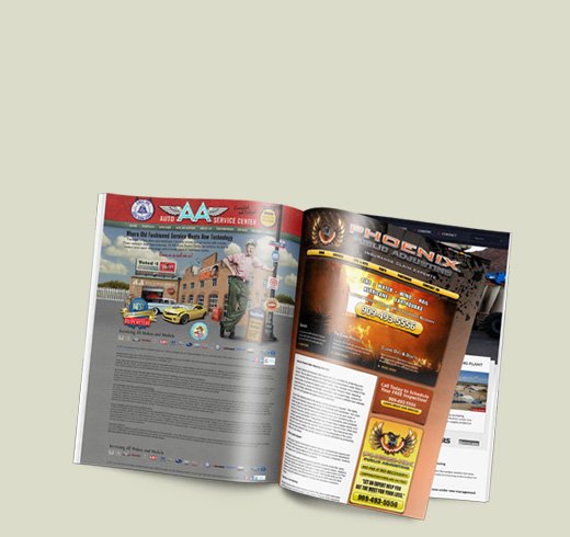
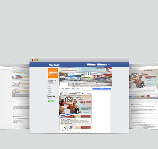
View our Case Studies
Explore the diversity of our work and how we made each one a success.
Let's get started -

RESOURCE CENTER
Resources to help you attract new and retain existing users.
Visit Our Resource Center -